

How to Choose the Right Size Vertical Wall Art for Every Room
Most people don't buy the wrong artwork—they buy the wrong size.
It's one of the most common decorating mistakes because beautiful artwork can still look awkward when its proportions don't relate to the room around it. A stunning print that's too small often disappears against a large wall, while artwork that's oversized for a compact space can dominate the room instead of complementing it. Neither problem reflects the quality of the artwork itself; it simply reflects a mismatch between scale and architecture.
Professional interior designers rarely begin by asking which artwork they like most. Instead, they study the room first. They consider ceiling height, furniture placement, wall dimensions, natural light and how people move through the space before deciding on the appropriate size. The artwork is chosen to complete the room rather than compete with it.
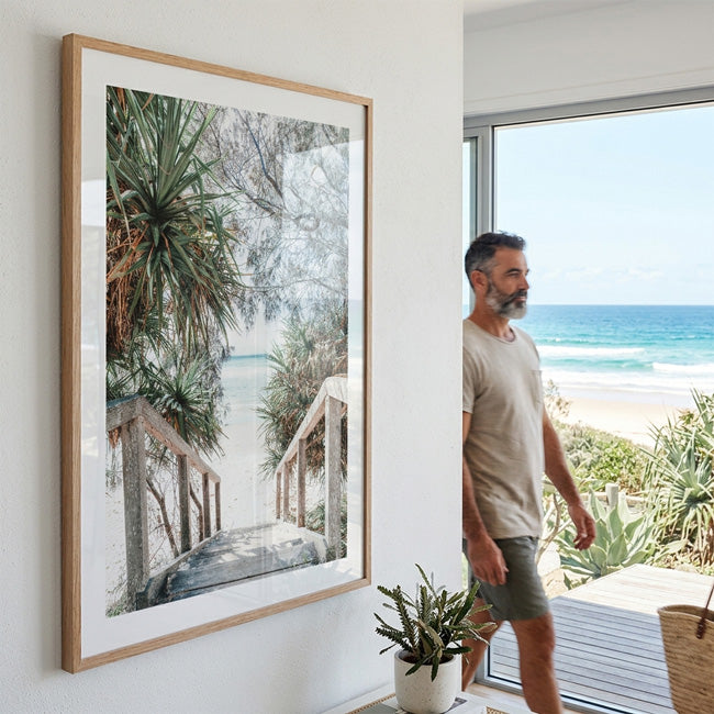
This is particularly true when selecting vertical wall art. Because portrait-oriented pieces naturally draw the eye upward, their impact depends heavily on proportion. A thoughtfully sized piece can make a room feel taller, more elegant and better balanced, while the wrong size can unintentionally make walls appear empty or cramped. Whether you're decorating a living room, bedroom, hallway, office or dining area, understanding scale is often the difference between artwork that simply fills a wall and artwork that transforms a space.
Living Rooms Need Balance Before They Need Size
The living room is usually the largest and most visually complex space in a home. Sofas, coffee tables, shelving, lighting and televisions already create several competing focal points, so artwork should help organise the room rather than introduce more visual confusion.
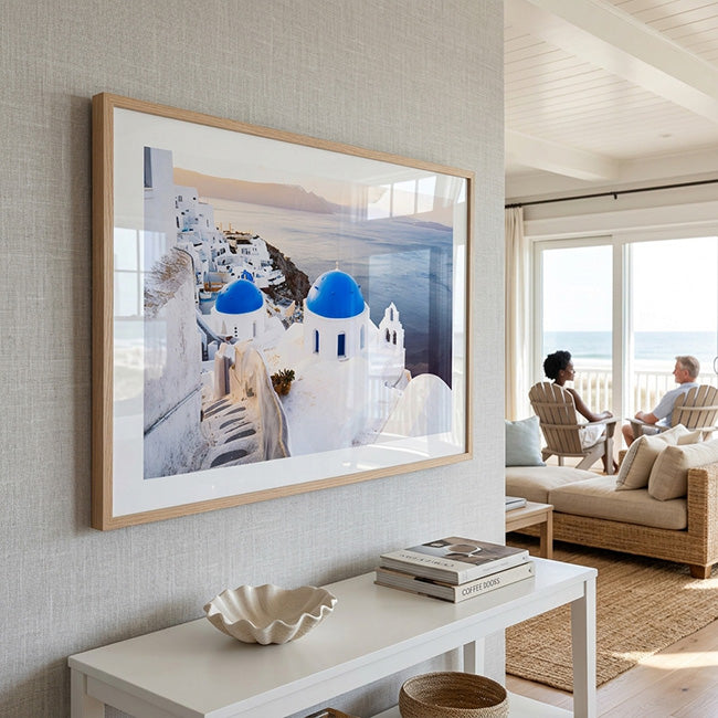
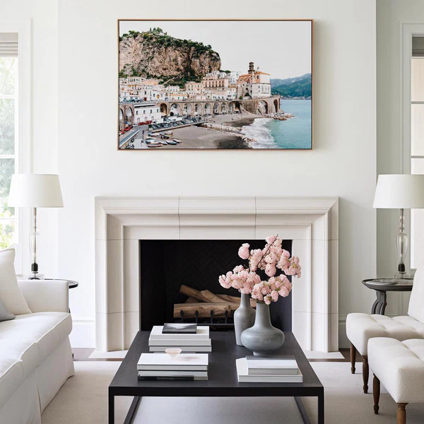
Many homeowners instinctively hang a single narrow portrait print directly above a wide sofa. Although the artwork may be beautiful, the proportions often feel disconnected because the width of the furniture overwhelms the height of the artwork. If the wall behind the sofa is especially wide, a horizontal composition may actually provide better balance because it reflects the furniture below.
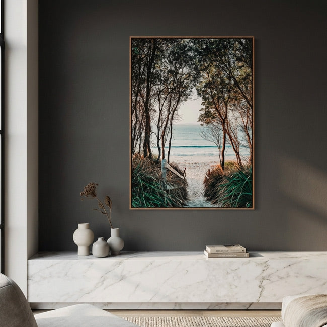
However, this doesn't mean vertical artwork has no place in the living room. Quite the opposite. Portrait-oriented pieces work exceptionally well on the walls surrounding the main seating area. The narrow space beside a fireplace, between tall windows, or next to built-in shelving often feels incomplete because standard landscape artwork doesn't suit its proportions. This is where large vertical wall art creates a striking architectural feature, introducing height while maintaining harmony with the room.
Instead of asking whether a living room should have vertical or horizontal artwork, ask which wall needs height and which wall needs width. The answer usually becomes obvious once you view the room as a whole rather than focusing on individual pieces.
Bedrooms Should Feel Calm, Not Crowded
Bedrooms are designed for rest, so proportion becomes even more important than decoration. Oversized artwork can make the room feel visually heavy, while pieces that are too small often create an unfinished appearance.
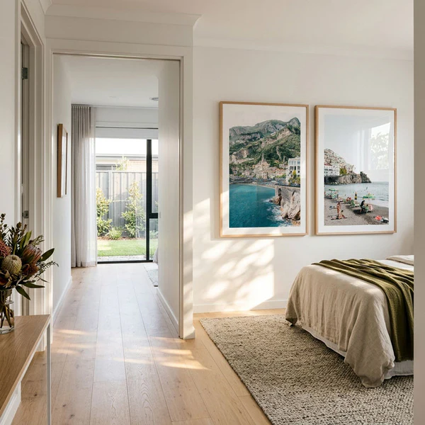
The wall above a bed usually benefits from horizontal artwork because it mirrors the width of the headboard and creates a sense of stability. Yet bedrooms rarely consist of one dominant wall. Empty spaces beside wardrobes, reading chairs or dressing tables often feel much taller than they are wide, making them ideal locations for vertical art for wall displays.
Portrait-oriented travel photography is particularly effective in bedrooms because it creates a quiet focal point without overwhelming the space. Scenes from Mediterranean villages, coastal cliffs or peaceful beaches naturally encourage slower eye movement, reinforcing the calm atmosphere that bedrooms should provide.
Our Vertical Wall Art collection includes many portrait compositions that work beautifully in these transitional spaces, especially where the goal is to soften architecture rather than dominate it. If you're creating a coastal or European-inspired bedroom, artwork from the Italy Wall Art collection can also introduce warmth and character while maintaining the room's relaxed mood.
Hallways Reward Height More Than Width
Few areas of a home are as overlooked as the hallway. Because these spaces are primarily designed for movement rather than gathering, many homeowners treat them as places to pass through rather than places worth designing.
Ironically, hallways are among the best environments for long vertical wall art.
Most hallways have limited width but generous wall height. Hanging wide artwork can make these spaces feel even narrower because it emphasises the corridor's horizontal dimension. Portrait-oriented pieces create the opposite effect by encouraging the eye to travel upward instead of across.
Spacing is equally important. Rather than filling every available section of wall, leaving breathing room between artworks creates rhythm as people walk through the space. The hallway begins to feel curated instead of cluttered, much like the corridors of boutique hotels or contemporary galleries.
If your hallway receives natural light, portrait photography featuring destinations with dramatic elevation—such as an Amalfi Coast Print—can further strengthen the feeling of openness by visually extending the architecture beyond the room itself.
Home Offices Need Inspiration Without Distraction
The modern home office has become far more than a place to answer emails. It's where ideas are developed, businesses are built and hours of focused work take place. The environment therefore needs to encourage concentration while remaining visually stimulating.
Most offices already contain strong horizontal elements. Desks, monitors, floating shelves and cabinets all establish a low visual horizon. Introducing vertical wall art helps counterbalance these lines, preventing the room from feeling flat or repetitive.
Rather than choosing artwork purely for decoration, think about what you want the space to communicate. Travel photography, architectural scenes and coastal landscapes often create a subtle sense of perspective, reminding us that creativity usually grows when we look beyond our immediate surroundings.
A Bondi Beach Print, for example, combines open skies, vertical palm trees and coastal movement in a way that introduces energy without overwhelming the workspace. Carefully placed beside a desk rather than directly behind a monitor, portrait-oriented artwork can become a quiet source of inspiration throughout the working day.
Dining Rooms Should Feel Connected
Dining rooms bring people together, so the artwork should support conversation rather than compete with it. If your dining table is long and positioned against a wide wall, horizontal artwork will often create the most natural relationship because both elements share similar proportions.
However, many dining rooms include secondary walls that feel empty once the furniture has been arranged. These spaces are ideal for vertical artwork, especially when positioned beside sideboards, display cabinets or architectural features.
The goal is not to make every wall identical but to create balance throughout the room. Combining horizontal artwork above the table with portrait-oriented pieces elsewhere introduces variety while maintaining a cohesive design language. It's the same approach used in luxury restaurants and boutique hotels, where different orientations work together to guide the eye naturally through the space.
The Right Size Creates Confidence
Choosing artwork isn't about following rigid measurements or decorating rules. It's about understanding relationships. The relationship between the artwork and the wall. Between the artwork and the furniture. Between the artwork and the way people experience the room.
When those relationships feel balanced, the artwork appears as though it has always belonged there.
That's why selecting the right size is often more important than selecting the right image. A well-proportioned piece of vertical wall art doesn't simply decorate an empty space—it strengthens the architecture, improves visual flow and quietly changes the atmosphere of the room.
Whether you're styling a compact apartment, a spacious family home or a modern office, taking the time to match the scale of your artwork to the character of the room will always produce interiors that feel more intentional, more comfortable and ultimately more memorable.


Leave a comment
This site is protected by hCaptcha and the hCaptcha Privacy Policy and Terms of Service apply.