


Vertical Wall Art vs Horizontal Wall Art: Which Creates the Better Interior?
Choosing wall art is often one of the final steps in decorating a home, yet it has the power to influence how a room is perceived more than many people realise. While colour palettes and furniture usually receive most of the attention, the orientation of artwork—whether vertical or horizontal—quietly shapes the balance, movement, and atmosphere of a space.
A common misconception is that one orientation is universally better than the other. In reality, experienced interior designers rarely think that way. Instead, they ask a different question: What is this room trying to achieve?
Sometimes a room needs to feel taller and more refined. Other times it benefits from feeling wider, calmer, or more connected. That's why both vertical wall art and horizontal compositions have an important place in thoughtful interior design. The secret isn't choosing one over the other—it's understanding when each works with the architecture instead of against it.
Great Design Begins with the Shape of the Room
Every room already tells a story through its proportions. Some spaces are long and narrow. Others have generous ceiling heights but limited wall width. Some rooms are open-plan, while others are intimate and enclosed.
Artwork should complement these existing proportions rather than compete with them.
Interior designers often describe this as creating visual harmony. When the orientation of the artwork echoes the architecture around it, the room feels intentional. When the orientation fights against the room's natural shape, even beautiful artwork can feel slightly out of place.
The decision between vertical artwork and horizontal art therefore begins with observing the room itself—not the artwork.
Why Vertical Wall Art Excels in Rooms That Need Height
One of the most powerful qualities of vertical wall art is its ability to guide the eye upward. Human vision naturally follows strong vertical lines, encouraging us to notice ceiling height rather than floor area.
This makes portrait-oriented pieces particularly effective in rooms where you want to introduce elegance or reduce the feeling of confinement.
For example, apartments with standard ceiling heights often benefit from long vertical wall art because it visually stretches the room without altering its structure. The effect is subtle, but it changes how people experience the space. Instead of focusing on limited floor dimensions, attention shifts upward, creating a lighter and more open atmosphere.
The same principle works beautifully in entryways. Since these spaces are usually narrow rather than wide, vertical compositions reinforce their proportions instead of making them appear compressed.
Hallways, staircases, reading corners, and the slim walls beside fireplaces or windows also naturally suit vertical art for wall spaces because the artwork reflects the architecture surrounding it.
Rather than filling empty space, it completes it.
Why Horizontal Art Creates Calm in Wider Rooms
Horizontal artwork works differently.
Instead of encouraging upward movement, it allows the eye to travel comfortably across a room. This creates a sense of stability, openness, and relaxation.
There's a reason many famous landscape paintings are horizontal. Oceans, mountain ranges, deserts, and countryside views naturally unfold across the horizon. Our brains associate horizontal movement with calm because it mirrors how we experience natural landscapes.
This makes horizontal artwork particularly effective above large furniture where the goal is visual continuity rather than height.
A long sofa, dining table, console table, or king-sized bed already establishes a strong horizontal line. Hanging artwork with a similar orientation creates balance because the furniture and artwork appear to belong together.
Rather than competing for attention, they become part of one larger composition.
This is why browsing a thoughtfully curated Horizontal Wall Art collection often feels like the natural choice when decorating expansive living rooms or wide bedroom walls.
Furniture Should Influence Your Decision
One of the biggest decorating mistakes is selecting artwork without considering the furniture beneath or beside it.
Artwork doesn't exist in isolation.
It becomes part of a relationship.
Imagine a wide three-seater sofa with a narrow portrait print hanging directly above it. Even if the artwork is beautiful, it may feel disconnected because the visual proportions don't relate to one another.
Now imagine the opposite scenario—a tall empty wall beside the sofa occupied by a horizontal print. The architecture suggests height, while the artwork suggests width. The eye receives mixed signals.
Professional designers usually avoid this conflict by matching the dominant architectural direction.
Wide furniture often pairs naturally with horizontal artwork.
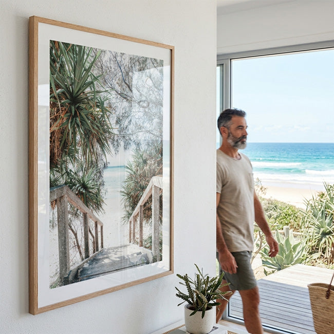
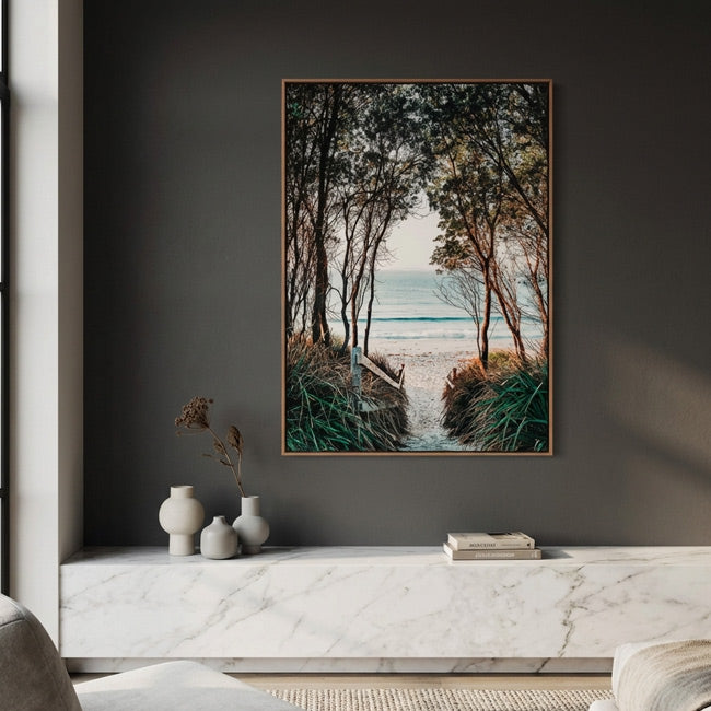
Tall architectural spaces frequently benefit from large vertical wall art.
The goal isn't rigid rules but visual conversation between the room and the artwork.
Every Room Has Different Priorities
A living room usually serves multiple purposes. It welcomes guests, encourages conversation, and often contains the home's largest furniture. If the main wall sits behind a long sofa, horizontal artwork often strengthens the room's natural proportions.
However, living rooms rarely consist of a single wall. Narrow spaces beside shelving, windows, fireplaces, or built-in cabinetry are often better suited to vertical artwork, creating balance without overwhelming the architecture.
Bedrooms offer another interesting example.
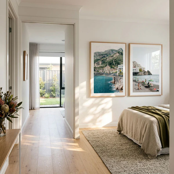
Artwork above the bed frequently works well in a horizontal format because it mirrors the width of the headboard. Yet the walls beside wardrobes, dressing tables, or reading chairs often benefit from portrait-oriented pieces that introduce height and softness.
Dining rooms can comfortably accommodate either orientation depending on the furniture layout. A long dining table often pairs beautifully with horizontal artwork, while a compact breakfast nook may feel more elegant with vertical compositions that draw attention upward.
Home offices present yet another scenario. Many desks already create strong horizontal lines through monitors, shelving, and work surfaces. Introducing a carefully chosen piece of vertical art can counterbalance those elements, making the room feel less static and more inspiring.
The best interiors rarely rely on one orientation alone.
Instead, they create rhythm through variety.
Subject Matter Matters Just as Much as Orientation
Orientation alone doesn't determine whether artwork feels appropriate.
The subject plays an equally important role.
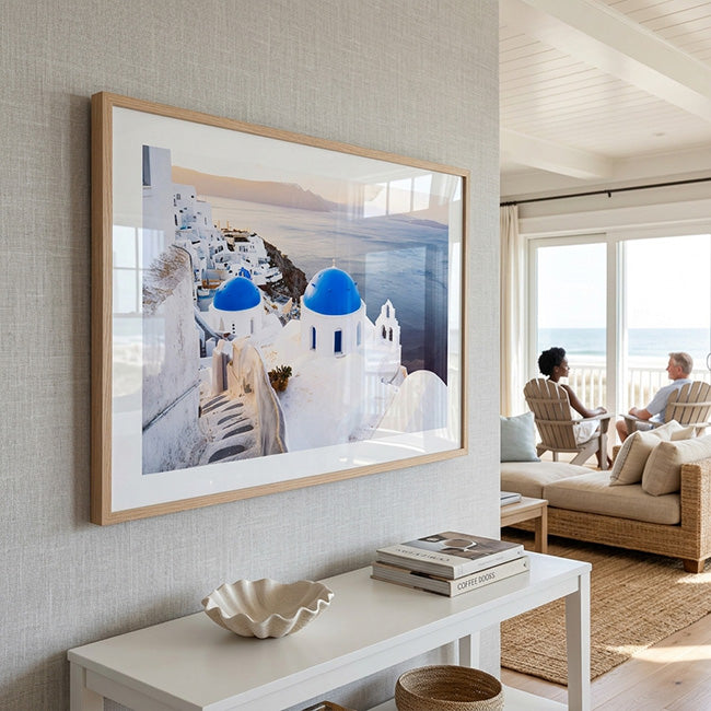
A dramatic cliffside village along Italy's Amalfi Coast naturally lends itself to portrait orientation because the landscape rises from the sea toward colourful architecture perched above. An Amalfi Coast Print displayed vertically reinforces the viewer's natural upward gaze, making the composition feel immersive rather than cropped.
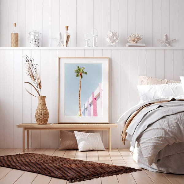
Likewise, beach scenes featuring tall palm trees or elevated coastal viewpoints often translate beautifully into portrait compositions. A Bondi Beach wall art Print, for example, captures not only the coastline but also the vertical movement created by palms, sky, and surrounding architecture.
By contrast, sweeping vineyards, rolling countryside, desert panoramas, or broad ocean horizons often reveal their full character in horizontal compositions. Their beauty lies in expansive width rather than dramatic elevation.
The artwork should reflect the way the landscape is experienced in real life.
The Most Beautiful Homes Use Both
One of the easiest ways to make a home feel professionally designed is to stop treating artwork as individual purchases and start thinking of it as part of an overall visual rhythm.
Homes filled exclusively with horizontal artwork can sometimes feel repetitive because every composition encourages the eye to move in the same direction.
Likewise, decorating entirely with portrait pieces may introduce unnecessary visual tension in rooms that naturally emphasise width.
Designers often combine orientations intentionally.
A spacious living room might feature a panoramic landscape above the sofa while using vertical wall art on adjacent narrow walls to introduce height and create visual balance. A hallway may rely almost entirely on portrait compositions, while a dining room embraces a wide statement piece that mirrors the table beneath it.
The variety isn't accidental.
It's what allows every room to respond to its own architecture while still feeling connected to the rest of the home.
Ultimately, the question isn't whether vertical or horizontal artwork creates the better interior. Great design is rarely built on absolutes. It's built on understanding proportion, movement, and the way people experience a space. When artwork works with the architecture rather than against it, both orientations become equally valuable—each contributing something different to the atmosphere of a home.

Leave a comment
This site is protected by hCaptcha and the hCaptcha Privacy Policy and Terms of Service apply.