

Black and White Beach Wall Art for Modern Homes: Beyond the Blue-and-White Look
When a Modern Home Needs More Than a View of the Sea
Imagine a living room with pale walls, a low-profile sofa, warm timber furniture and carefully chosen lighting. Nothing feels excessive, and every object has room to breathe. Yet something about the space feels unfinished. The furniture is well proportioned, the colours work together, and the materials have been chosen with care, but the room lacks a focal point capable of giving it character. This is a familiar challenge in contemporary interiors: restraint creates visual calm, but too much restraint can leave a room feeling impersonal.
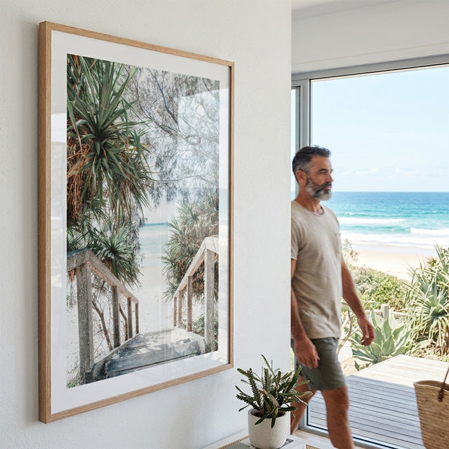
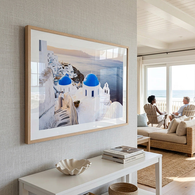
Coastal artwork offers a natural solution, although the obvious approach is not always the most successful. Blue oceans, sandy beaches and whitewashed interiors have become familiar visual shorthand for seaside living. There is nothing inherently wrong with these choices, but when the artwork, cushions, accessories and furniture all repeat the same palette, the room can begin to resemble a literal interpretation of a beach house rather than a considered modern interior.
Black and white beach wall art offers a different way to establish that connection. Instead of relying on the recognisable colours of the coast, monochrome photography draws attention to the elements that remain when colour is removed: the shape of a shoreline, the contrast between waves and rocks, the silhouette of a surfer, or the long horizontal line where the ocean meets the sky. These qualities allow coastal imagery to work within a much broader range of interiors, from warm minimalist homes to contemporary apartments and spaces that combine modern furniture with traditional materials.
The distinction matters because good interior design is not simply about choosing objects that match. It is about understanding what each object contributes to the atmosphere of a room. A carefully selected beach photograph can introduce movement into an otherwise static space, soften the geometry of modern architecture and give a neutral palette a stronger sense of identity.
Why Removing Colour Can Reveal More of the Coast
Colour is often the first thing we notice in a photograph. A turquoise sea immediately suggests summer, while a golden horizon evokes the warmth of late afternoon. These associations are powerful, but they can also direct our attention towards a familiar idea of the beach rather than the particular qualities of the landscape itself.
Monochrome photography changes that relationship. Without colour to establish the mood so quickly, the eye begins to read the image through light, tonal contrast, texture and composition. A wave becomes a pattern of highlights and shadows; rocks reveal their irregular surfaces; and a distant figure gains significance because of its relationship to the surrounding space. The coast is no longer represented primarily through its colours but through the forms and relationships that make each scene distinctive.
This way of seeing has a substantial place in photographic history. The National Gallery of Australia's exhibition, Recent Australian Photography, discusses the continuing tradition of black-and-white photography in Australia, including beach scenes associated with Sydney. The gallery's wider exploration of Australian photography from 1972 to 1982 also considers how landscape photography can move beyond straightforward description towards more abstract and symbolic interpretations of place.
These ideas help explain why black and white beach art can feel so different from a conventional colourful beach print. The photograph becomes less dependent on the seasonal associations of a particular palette and more dependent on its visual construction. Strong horizontal lines can create a feeling of stability, deep shadows can introduce drama, and open expanses of sky or water can make a composition feel spacious.
For a modern home, that flexibility is valuable. The artwork does not need to dictate the room's colours because its visual impact comes from the relationship between light and dark. It can sit above a beige sofa, against a warm white wall or alongside darker furniture without requiring the rest of the interior to adopt a beach-inspired palette.
The Modern Coastal Interior Is About Materials, Not Nautical Motifs
The evolution of coastal interiors provides useful context for choosing artwork. Traditional nautical decorating often communicates its theme through recognisable objects: anchors, ropes, boat motifs, striped textiles and strong combinations of blue and white. Contemporary coastal design can be subtler, relying instead on natural materials, open space, restrained colour and the relationship between indoor environments and the landscape outside.
Architectural Digest's guide to coastal interior design explores the role of natural materials, soft palettes, clean lines and landscape-inspired elements in coastal spaces. The underlying principle is useful beyond homes located beside the sea: a room can evoke the coast through its textures, proportions and atmosphere without reproducing its familiar decorative symbols.
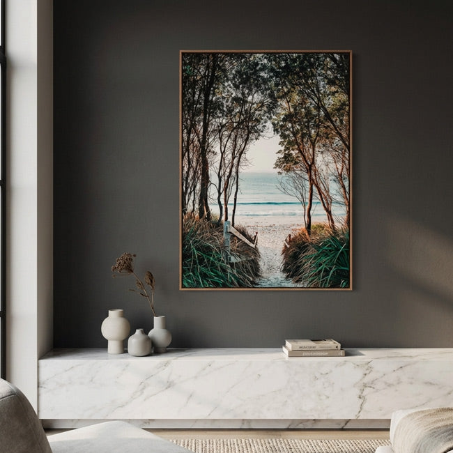
Think about the materials commonly found in a modern living room. Timber introduces warmth and visible grain; linen softens the appearance of upholstered furniture; stone contributes weight and irregularity; and woven fibres add texture without necessarily introducing another dominant colour. Against these materials, monochrome coastal photography provides a different kind of contrast. Its dark tones can give a pale room definition, while the softer gradations of the image can prevent that contrast from feeling harsh.
A photograph of the ocean also introduces a visual quality that furniture alone cannot easily provide: distance. Even a relatively small image can contain a foreground, middle distance and horizon, creating a sense of depth on a flat wall. This becomes especially effective in interiors where the furniture has simple silhouettes and the surfaces are largely uninterrupted.
The result is not a room decorated around a beach theme, but a room in which the landscape contributes to the design. That distinction allows black and white beach wall art to feel at home in a city apartment just as naturally as it does in a coastal property.
Choosing Artwork That Complements Modern Architecture
Once the broader design approach is clear, the next question is what kind of photograph will work best. Not every coastal image creates the same atmosphere, even when the subject matter is similar. The composition, the amount of open space and the relationship between the main subject and its surroundings all influence how the artwork behaves within a room.
A photograph dominated by a long horizon can complement modern architecture because both rely on strong horizontal lines. Hung above a sofa or a low console, it can reinforce the room's proportions without introducing unnecessary visual complexity. An image featuring a surfer, a rocky shoreline or a pier offers a more concentrated focal point. The eye has something specific to discover, while the surrounding water and sky prevent the composition from becoming visually crowded.
Consider the BW Wategos Surfer Art Print from Oblong Shop. Photographed by Seus Ku, the image captures a lone surfer crossing a rocky shoreline at Wategos in Byron Bay. Its appeal comes from the relationship between the figure, the landscape and the contrasting textures of rock and water. Rather than presenting the beach simply as a beautiful view, the photograph records a moment of movement within a larger environment.
That kind of composition can be particularly effective in a contemporary room because it introduces a human element without turning the artwork into a portrait. The figure gives the eye a point of focus, while the landscape maintains a sense of openness. In a room with streamlined furniture and relatively few accessories, this balance can make the artwork feel substantial without overwhelming the space.
For a quieter interpretation, the BW Newport Beach Art Print offers another approach. Its shoreline, natural light and subtle tonal contrasts create a more restrained atmosphere. An image of this kind may suit a bedroom, reading area or living room where the intention is to establish visual calm rather than introduce a dramatic focal point.
These examples illustrate an important principle: choose the photograph for the relationship it creates between the subject and the space, not merely because its location or subject fits a coastal theme.
How Scale Changes the Role of Coastal Photography
Scale determines whether artwork feels like a finishing detail or a central part of the room's composition. In modern interiors, where furniture and architectural features often have clear geometric forms, a suitably sized photograph can establish a visual counterweight to the surrounding structure.
A large print can work especially well when the image contains a broad horizon, open water or a relatively simple arrangement of forms. At a larger size, these elements have room to develop across the wall, and the photograph becomes something the viewer can experience rather than merely recognise. The surrounding negative space also matters: an image should have enough room around it to remain distinct from nearby furniture, windows and architectural details.
Smaller prints serve a different purpose. They can introduce a point of interest beside a desk, in a hallway or within a group of artworks. Several photographs can also form a gallery wall, provided the images share a clear relationship through subject matter, tonal treatment, framing or composition. A mixture of expansive landscapes and more concentrated scenes can create variety without making the arrangement feel random.
Before choosing a size, consider the wall's dimensions, the furniture beneath it and the distance from which the photograph will usually be viewed. A wide sofa may need a substantial horizontal print or a carefully arranged group of works, whereas a narrow wall may benefit from a more compact composition. These decisions are more reliable than choosing a size simply because it looks impressive in a product photograph.
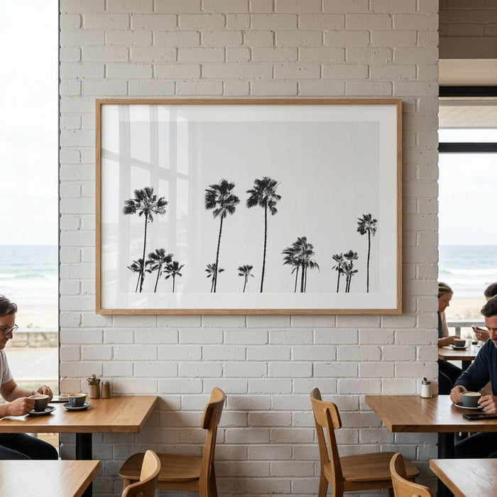
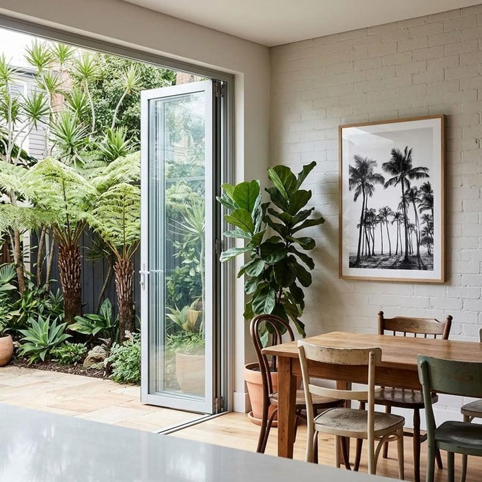
Framing should follow the same logic. Black frames can reinforce contrast and establish a crisp boundary around the image, while natural timber introduces warmth and connects the artwork to wooden furniture or flooring. White frames can make a photograph feel quieter against a pale wall. None of these finishes is universally best; the right choice depends on the image's tonal range and the materials already present in the room.
Let Natural Textures Do the Work of Colour
One of the advantages of a monochrome palette is that it leaves room for texture to become more prominent. When the artwork does not introduce a strong additional colour, the materials around it can contribute warmth and complexity without competing for attention. This is particularly useful in neutral interiors, where the difference between a sophisticated space and a flat one often lies in the variation of surfaces rather than the number of colours used.
A natural timber frame against a warm white wall creates a softer transition than a stark black frame. Linen upholstery introduces a subtle irregularity that contrasts with the more defined shapes in the photograph. Stone, wool and woven materials add further variation, allowing the room to feel layered even when its palette remains restrained.
This approach also prevents the interior from becoming overly coordinated. There is no need for every cushion, rug and accessory to refer to the ocean. A monochrome photograph can coexist with artwork of a different subject, sculptural ceramics or contemporary lighting because its connection to the coast is expressed through the image itself rather than repeated throughout the room.
The most successful coastal interiors often leave space for these different influences. The artwork establishes a relationship with the landscape, while the furniture and materials allow the room to retain its own character. Instead of creating a themed environment, the design develops through the interaction of individual elements.
Beyond the Blue-and-White Look
The appeal of monochrome coastal photography is ultimately not that it replaces blue with black and white. It is that it offers a different way of interpreting the coast. Rather than depending on the colours associated with summer or seaside living, it draws attention to composition, movement, light and the distinctive character of a place. Those qualities allow a photograph to remain relevant as furniture, accessories and interior preferences change.
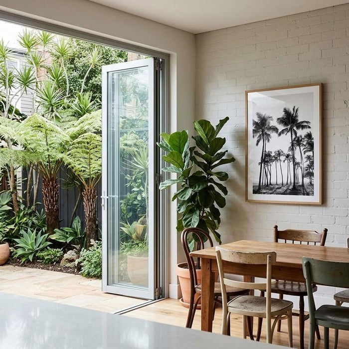
For anyone considering this approach, it is worth exploring the Black & White Coastal Wall Art collection at Oblong Shop. The collection brings together original photographs by Seus Ku featuring Australian beaches, surfers, ocean landscapes, coastal architecture and palm trees. The variety of subjects makes it possible to choose artwork according to the atmosphere a room needs, whether that means an expansive shoreline, a more graphic architectural scene or a fleeting moment of human activity beside the water.
A modern home does not need to imitate the coast to feel connected to it. Sometimes the more considered choice is a photograph that leaves the room's existing design intact while introducing something it previously lacked: a sense of distance, a stronger focal point or a reminder of the landscape beyond the walls. When monochrome photography, natural materials and thoughtful proportions work together, the result is coastal in feeling without being confined to a particular decorating style.

Leave a comment
This site is protected by hCaptcha and the hCaptcha Privacy Policy and Terms of Service apply.