

How to Style Black and White Beach Wall Art in Your Home
The Difference Between Decorating with the Beach and Decorating with Its Atmosphere
There is a particular challenge in designing a coastal-inspired home: how do you evoke the feeling of the ocean without making the room look as though it belongs in a seaside souvenir shop? Shell motifs, striped cushions, driftwood accessories and shades of blue can all communicate a connection to the coast, but when too many of these elements appear together, the idea can become more literal than the atmosphere it is meant to create. A room may look recognisably coastal without capturing the qualities that make the shoreline so compelling in the first place: its changing light, expansive space, irregular textures and constant movement.
Photography offers a different approach. Rather than decorating with objects associated with the beach, it allows the landscape itself to become part of the interior. A photograph of a distant shoreline can introduce a sense of openness; a lone surfer can create a focal point without dominating the room; and the meeting of ocean, rock and sky can add visual complexity to a wall that might otherwise feel empty. This is where black and white beach wall art becomes particularly useful. Removing colour shifts attention towards the structure of the image, allowing the viewer to notice details that might be less obvious in a colourful photograph.
The aim, therefore, is not simply to place a beach picture above a sofa. It is to choose an image whose composition, scale and tonal character contribute something meaningful to the room. Once that distinction is understood, styling coastal photography becomes less about following a theme and more about making considered decisions about space, contrast and visual balance.
Why Monochrome Photography Works Beyond the Traditional Coastal Palette
Colour is one of the most immediate ways an artwork influences a room. A vivid turquoise sea or a golden sunset can establish a strong palette before the viewer has considered the photograph's subject. Black and white photography works differently: it reduces the influence of colour and makes the relationship between light and dark more prominent. Shadows become more noticeable, the shape of a wave can read almost like a drawn line, and the horizon can establish a clear boundary between the sky and the water.
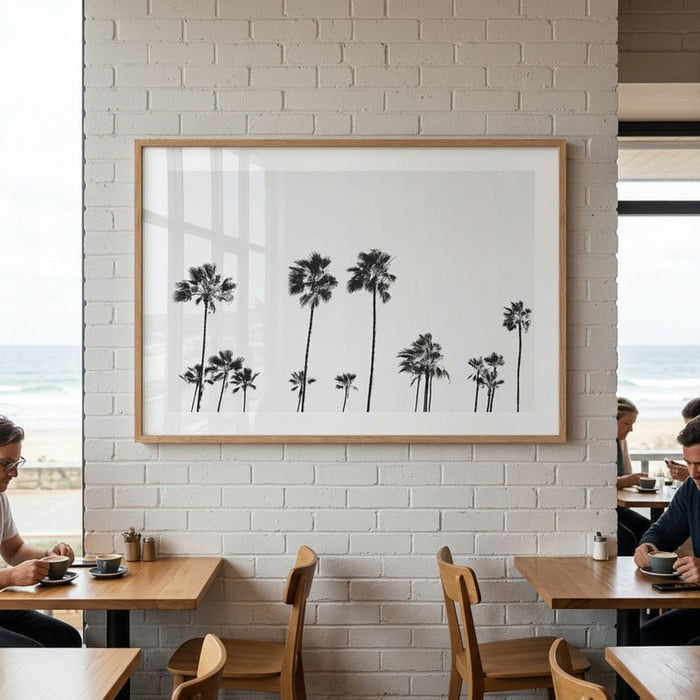
These qualities help explain why monochrome coastal photography can sit comfortably within interiors that are not explicitly beach-themed. In a contemporary living room with pale walls, timber furniture and restrained accessories, a black and white ocean print can introduce contrast without adding another dominant colour. In a darker room, the same kind of artwork can create a visual pause, particularly when the photograph contains lighter areas that stand apart from the surrounding wall.
This approach also has a meaningful connection to the history of landscape photography. The National Gallery of Australia's discussion of Australian photography describes the continuing tradition of black and white imagery in the representation of Australian places, including Sydney's beaches. Monochrome coastal photography is therefore not merely a convenient match for a neutral interior; it belongs to a longer photographic tradition in which landscape is explored through tonal relationships, composition and the character of a place.
For the home, the practical lesson is straightforward: choose a photograph for what it contributes visually, not just for the fact that it depicts the sea. Two beach pictures may share the same subject yet create entirely different effects. One might feel energetic because of its strong contrasts and active figures, while another may feel quieter because it contains a broad horizon and generous areas of open space.
Begin with the Room, Not the Artwork
Before choosing a print, consider what the room already needs. An interior with clean architectural lines, a large sofa and limited decoration may benefit from an image with a strong focal point. A room filled with books, objects, patterned textiles and collected furniture may need something more spacious and visually restrained. Thinking about the existing environment first helps prevent the common mistake of choosing an artwork simply because it looks attractive in isolation.
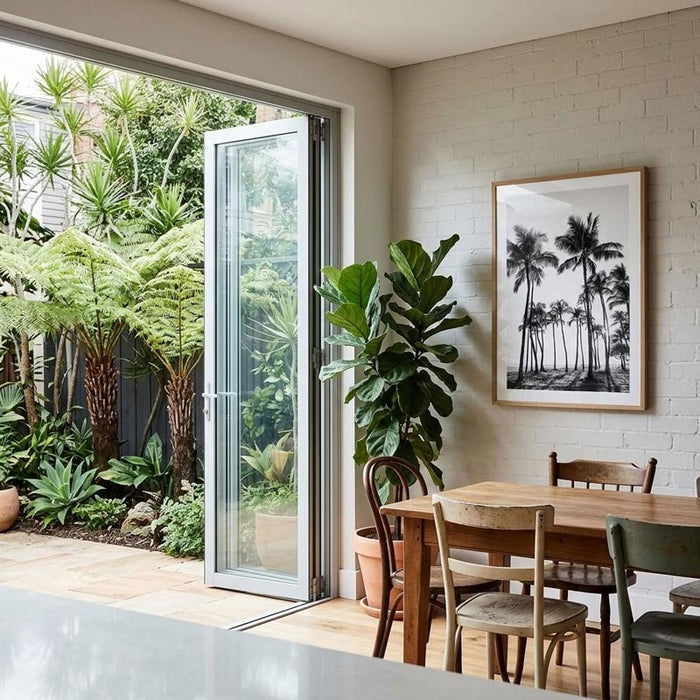
Look at the wall where the photograph will hang and notice the visual weight of the furniture below it. A wide sofa generally calls for an artwork with enough width to relate to the furniture, whether that means one substantial print or a carefully arranged group of smaller works. A narrow wall beside a doorway may be better suited to a vertical composition, perhaps one in which a palm, a figure or a stretch of coastline gives the image a clear direction.
The subject matters, too. A photograph dominated by a horizon tends to draw the eye across the wall, making it a natural option above a long console or sofa. An image featuring a person or surfer may create a more concentrated focal point, particularly when the figure appears against a large area of sea or sky. For example, BW Wategos Surfer Art Print uses the relationship between a lone surfer and the rocky shoreline to bring movement and a sense of place into the composition. It can work well when the room needs a recognisable subject rather than another purely abstract arrangement of tones.
Get the Scale Right: Why Size Changes the Experience
One of the most consequential decisions in styling wall art is scale. A photograph that looks impressive on a product page may feel insignificant when placed above a large sofa, while a very large print can overwhelm a compact room if the image is visually dense. The important question is not simply how much wall space the artwork occupies, but how its composition behaves at the intended size.
A photograph with an expansive horizon, open sky or relatively simple arrangement can often support a larger format because the image gives the eye room to move. At a larger scale, subtle variations in water, shoreline and cloud become easier to appreciate, and the photograph begins to function as a significant part of the room's architecture. By contrast, an image with a concentrated subject or strong graphic detail may have considerable impact at a smaller size because the eye can understand its central idea quickly.
For a living room, measure the furniture and the available wall rather than estimating from memory. The artwork should feel connected to the furniture beneath it, while leaving enough surrounding space for the composition to remain distinct. In a bedroom or hallway, where the viewing distance and furniture arrangement differ, a smaller print may create a more natural relationship with the space. These are useful starting points rather than fixed rules; the right size ultimately depends on the image, the wall and the way the room is used.
If the photograph is intended to anchor the room, give it enough space to perform that role. If it is one element in a larger arrangement, think about how its dimensions relate to the other frames and the gaps between them.
Build the Styling Around Texture, Not a Beach Theme
Once the photograph is chosen, the surrounding materials can help it feel integrated rather than simply attached to the wall. Modern coastal interiors often use natural wood, linen, woven fibres and restrained colours to create a connection with the seaside without reproducing it literally. Architectural Digest's guide to coastal interior design discusses the importance of natural materials, soft neutral palettes, clean lines and the way architecture can frame the landscape.
These principles work particularly well with monochrome photography because the materials add warmth while the artwork supplies contrast. A black and white beach print above a light-oak console, for example, can balance the warmth of the wood with the clarity of the photograph. Linen upholstery introduces softness; a wool rug adds a tactile layer; and a ceramic object can provide an organic shape without competing with the image.
There is no need to make every accessory coastal. In fact, a room often feels more considered when the connection to the sea is concentrated in one or two elements rather than repeated throughout the space. A photograph of the shoreline can sit alongside contemporary furniture, vintage pieces, sculptural lighting or art from entirely different subjects. Its role is to contribute a particular visual quality, not to dictate the identity of every object around it.
This is also why black and white coastal prints can be effective in homes that combine several design influences. Their limited palette allows them to connect with different materials and colours, while the specific landscape keeps the artwork from feeling generic.
Choose a Frame That Supports the Photograph
Framing should be treated as part of the composition, not an afterthought. A black frame can reinforce the graphic quality of a high-contrast image and create a defined edge against a pale wall. A natural timber frame can soften the overall effect and connect the photograph to wooden furniture or flooring. A white frame may allow the artwork to blend more quietly into a light interior, while a metallic finish can introduce a more deliberate decorative accent.
The best choice depends on the photograph's tonal range and the room's materials. If the image contains deep shadows and striking contrasts, a black frame can echo those qualities. If the photograph is softer, with misty light or a broad, pale horizon, natural wood or white may preserve its understated character. The frame should establish a boundary around the image without becoming more noticeable than the photograph itself.
Consistency is especially useful when several works will hang together, but matching every frame is not always necessary. A pair of related beach photographs may look cohesive in identical frames, while a collected gallery wall can accommodate different frame finishes if the spacing and overall arrangement feel intentional. The objective is visual coherence rather than uniformity for its own sake.
One Statement Print or a Gallery Wall?
A single large photograph gives the room one clear focal point. This approach is particularly effective when the image has a strong composition and the surrounding furniture is relatively restrained. A print such as BW Newport Beach Art Print offers a quieter interpretation of the California shoreline, with natural light and subtle tonal contrast that can complement a contemporary living room, bedroom or office without overwhelming it.
A gallery wall creates a different experience. Rather than presenting one complete view, it allows several photographs to establish a relationship with one another. You might combine a broad shoreline, a closer study of waves and a photograph featuring a surfer or palm trees. The connection between the works can come from their monochrome treatment, their coastal subject matter or a shared sense of atmosphere.
The risk is that a gallery wall can become visually crowded if every image competes for attention. Before hanging anything, arrange the prints on the floor or create paper templates to test the composition. Consider the overall outline of the group, the space between frames and the balance between images with strong subjects and those with more open space. A little variation can make the arrangement interesting, but a clear relationship between the photographs helps it feel deliberate.
For inspiration, explore the Black & White Coastal Wall Art collection, which brings together monochrome photographs of beaches, ocean landscapes, surfers, coastal architecture and palm trees. Looking across different subjects can help you decide whether your room needs one defining image or a sequence of photographs that tell a broader story about the coast.
Let the Photograph Belong to Your Home
The most successful styling decisions are rarely the ones that follow a rigid formula. A coastal photograph can be chosen because it recalls a place you know, because its composition brings balance to a wall, or simply because you continue to notice something new in it. These reasons are often more enduring than choosing artwork to match a short-lived colour trend.
Black and white beach wall art is especially adaptable because it can connect a room to the coast without requiring the rest of the interior to follow a coastal theme. The photograph might provide contrast in a minimalist home, introduce a sense of openness to a compact room or add a personal point of reference to a space filled with collected objects. Its success depends on the relationship between the image and its surroundings: the scale of the wall, the materials nearby, the amount of visual activity in the room and the character of the photograph itself.
Rather than trying to recreate the beach indoors, choose an image that captures something specific about it. That might be the geometry of a jetty, the movement of a wave, the distance between a figure and the horizon or the changing texture of the shoreline. When the photograph has a clear visual identity and is given the right space, it becomes more than a decorative reference to the sea. It becomes an integral part of the room's design—and a piece of the landscape you can continue to experience long after you have left the coast.

Leave a comment
This site is protected by hCaptcha and the hCaptcha Privacy Policy and Terms of Service apply.